Customizing the Size of Your Poll
When our poll widget displays on your website it will stretch to fill whatever container you put it in.
For most purposes this is fine, if you put it within a sidebar that has a fixed width, our widget will stretch to fill the sidebar and should just work.
However, inside the body of an article that has a responsive design that resizes to fit both tablet and desktop screens things begin to work a little differently.
If you place our poll embed code into the body if your article without putting a fixed size container around it, whilst it might look fine on mobile, it will size to fill the screen of a desktop website.
This is why we recommend wrapping your widget embed code in another <div> tag and using a simple style tag to fix the size of your widget.
Here is some example code that does exactly that:
<div style="width: 100%; max-width: 32rem;">

    <div class="klixEmbed" data-id="gauge_id"></div>
    <script src="https://goklix.com/api/gauge/gauge_id/embed.js" async></script>

</div>
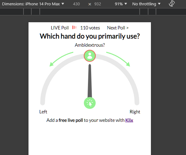
The above code makes the widget fill the width of the screen on smaller devices:

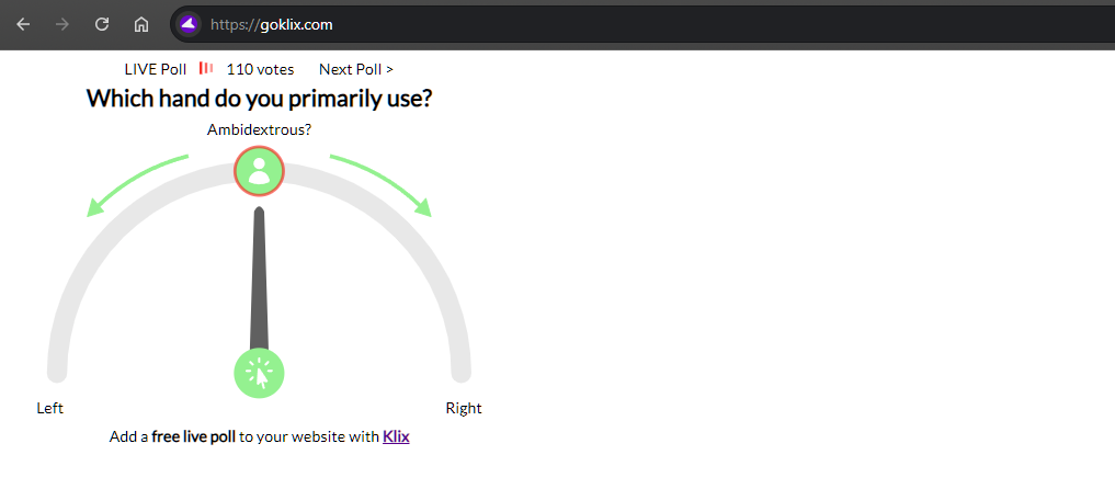
Bbut on larger devices it will limit itself to approximagely 500 pixels wide:

We with all good responsive design, this won't work correctly unless you ensure your <head> tags contain a correct viewport meta tag definition.
<head>
    <meta name="viewport" content="width=device-width, initial-scale=1">
</head>